How to choose the right photo?
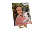
Have you decided to paint a picture according to your own photo? We're ready and waiting impatiently for your template - do you already know which photo to choose?
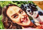
Choosing a photo is important! The result will depend on its quality. Here are some recommendations and tips on how to choose the right photograph. As we have up to 700 different colours in our palette, take good care in choosing a photo with a good resolution, and we will guarantee you the best result on the market with painting by numbers.
WHICH PHOTO IS A GO!
- It has to have a minimum of 100kB, or more (If the photo has at least 100kB, but it is blurred or grainy, it is recommended to choose a larger photo with a better quality.).
- Needs to be sharp.
- Has a good detail of well-lit face(s) up close (Tiny faces tend to disappear in the painting.).
- Has a blurred background (A picture with a blurred background, looks impressive and enables the details to stand out at the front. In addition, it will give you less work with painting.).
- For painting by numbers, ideally one would select a detailed photo of a couple, family, individual, or a pet, where the focus [of attention] is in the foreground and also takes up almost the entire photo, is one which is ideal for a painting-by-numbers project. Nature and urban sceneries, still life, buildings, or even your favourite fruit are also easy to paint.
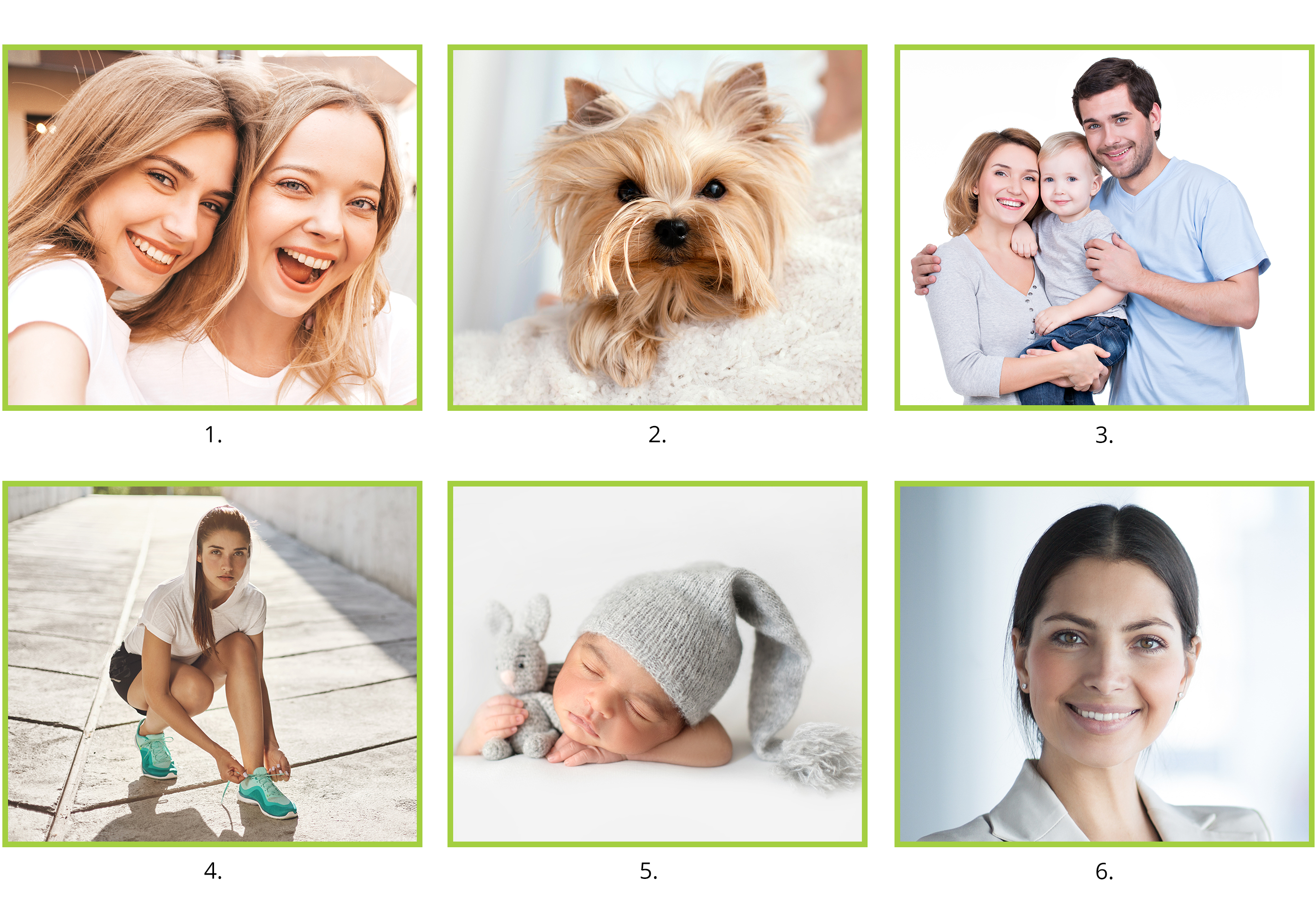
- Portrait photo with a blurred background
- A favorite pet
- Focused small groups of people, photographed above the waist
- A photo of an entire person.
- Studio photos
- Face detail with a blurred background
WHICH PHOTO IS A NO GO?
- Dark. Shaded figures will be poorly painted, especially if they have shadows over their faces.
- Overlit. Too much light changes the colour of the entire photo, and the result will not look natural.
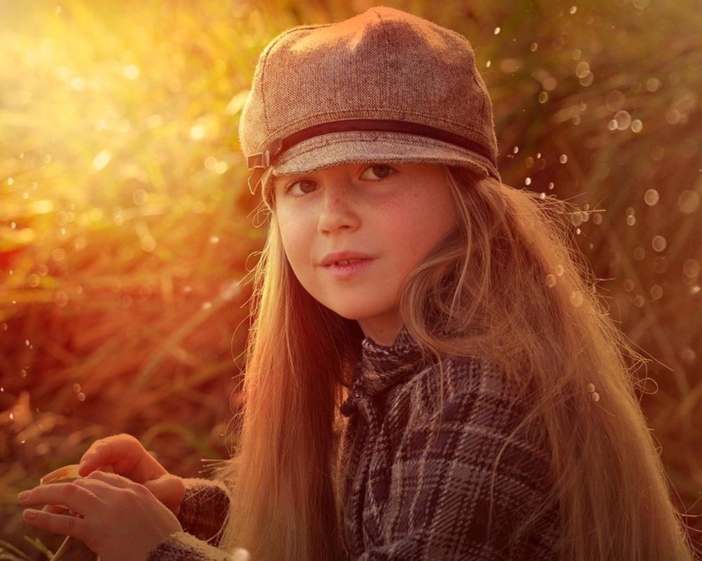
- A face in the shadow, or illuminated by the sun. The resulting image design will then be spotty and unsuitable for painting.
- Small faces.
- Too many people. A large group of more than 5 people will not be painted well, and their faces will be quite odd.
- When the focus is too blurry and blends in with the background.
When photos have many poorly visible traits, too many people with small faces, or faces that blend in with the background, we have to return the photographs for reconsideration. They are not suitable.
.
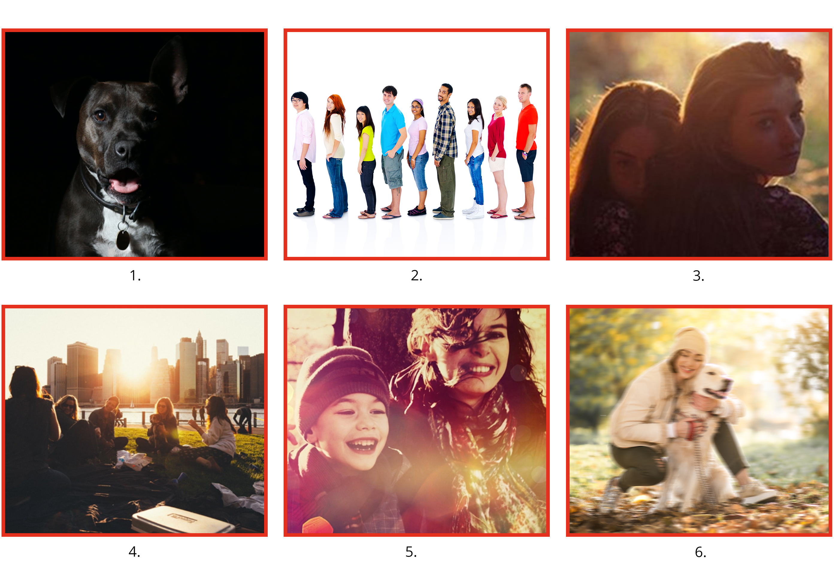
- A very dark background that blends in with the subject at the front.
- Too many people.
- A shaded face.
- An overlit photo with small faces.
- A poorly lit photo.
- A blurred photo.
What do graphic designs from unsuitable photos look like?
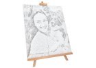
Take a look at these few examples. On the left side are photos, that consistently don’t meet the required selection criteria, and on the right side are the corresponding graphic designs, which serve as models for the future paintings.
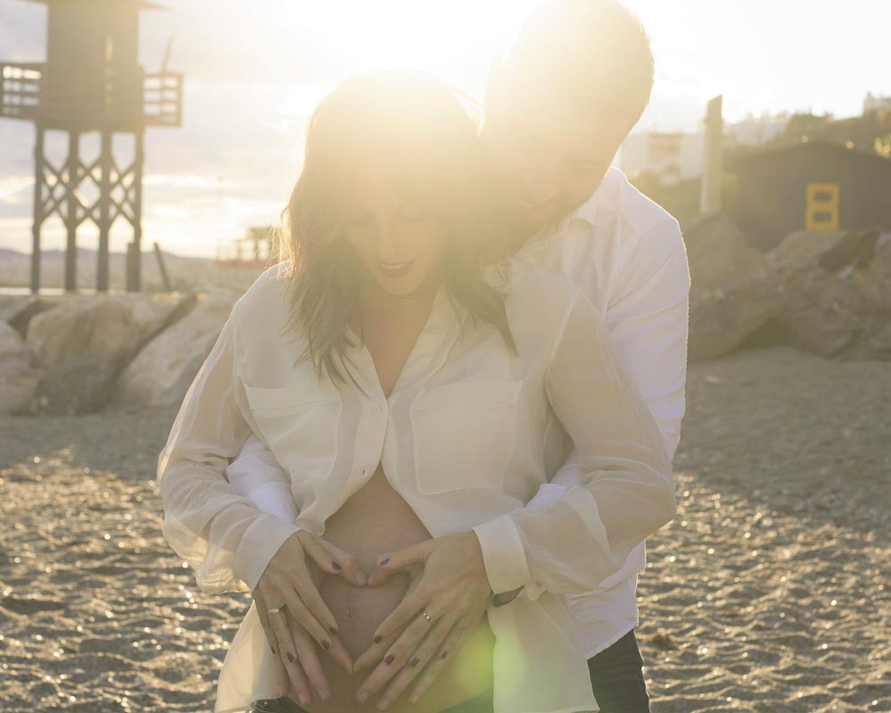
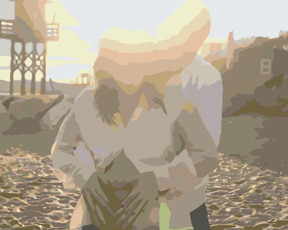
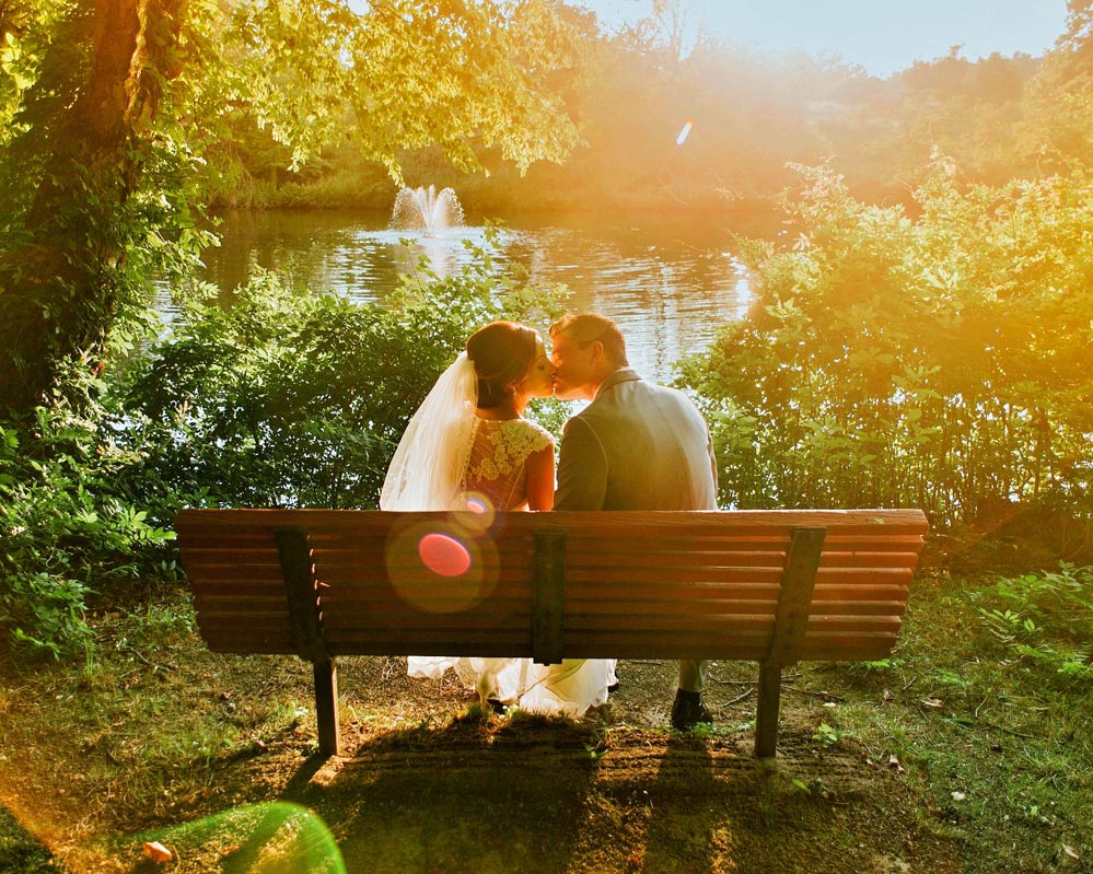
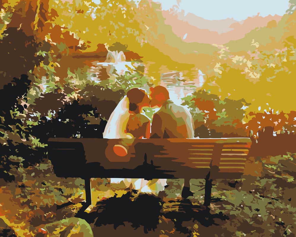
1. and 2. – overexposed photos.
Because the people’s faces in the photo are not visually clear, the graphic design software cannot capture anything.
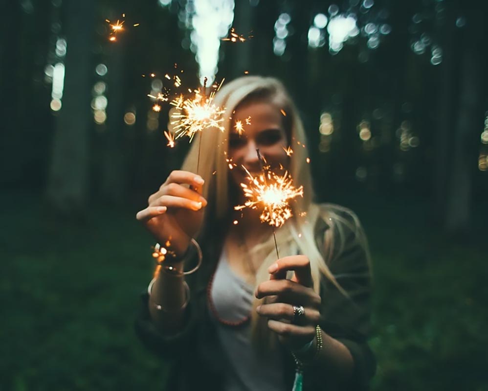
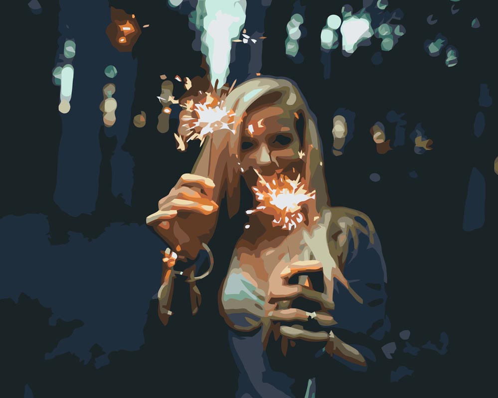
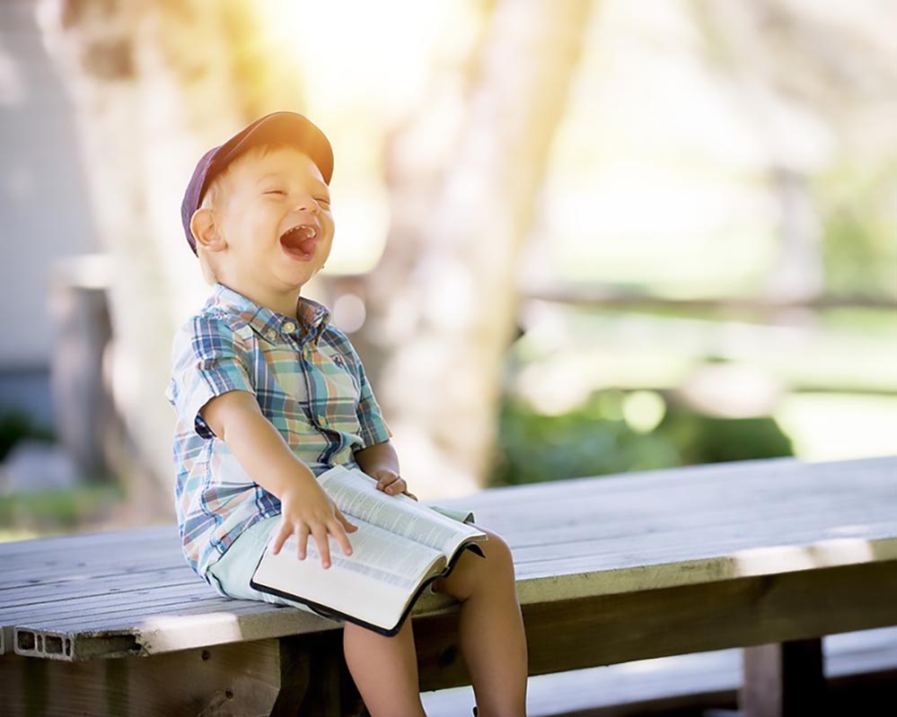
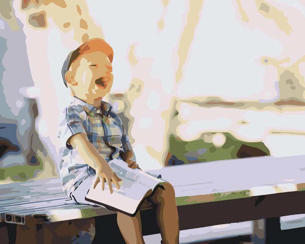
3. and 4. – blurred photos.
Blurred faces that lack sharp outlines cannot be captured properly by the software, as a result they look spotty.
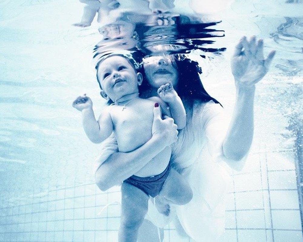
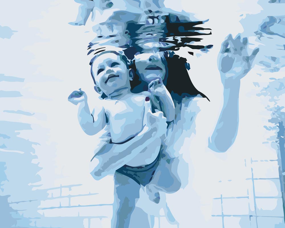
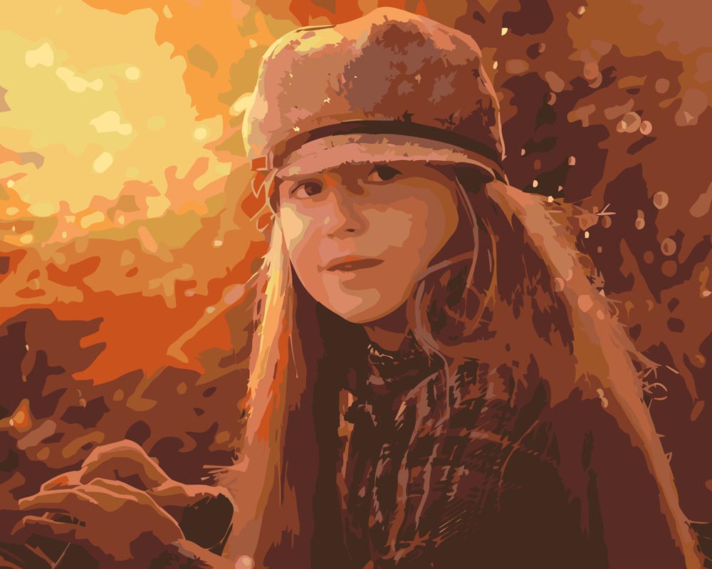
5. and 6. – the colours of the objects or models blend in with the background.
It may seem to our eyes, that people in the foreground have natural colours, when in fact they are just blending into the background.
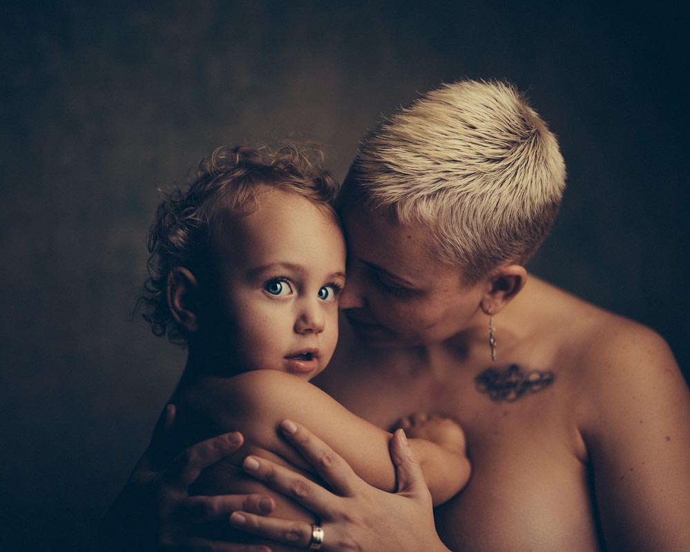
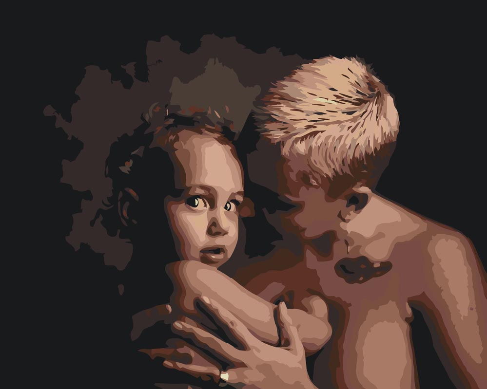
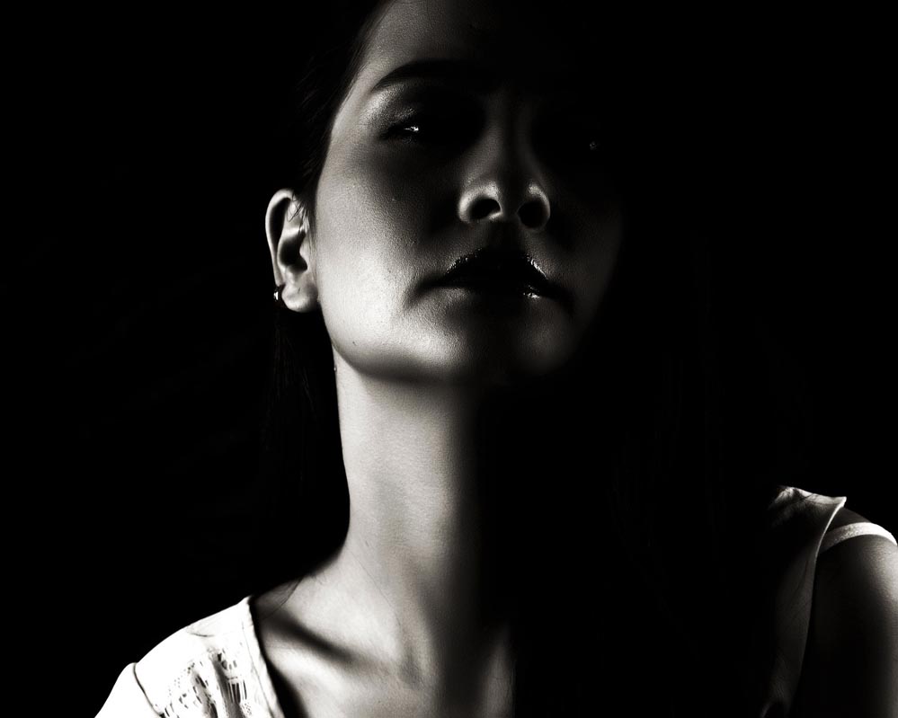
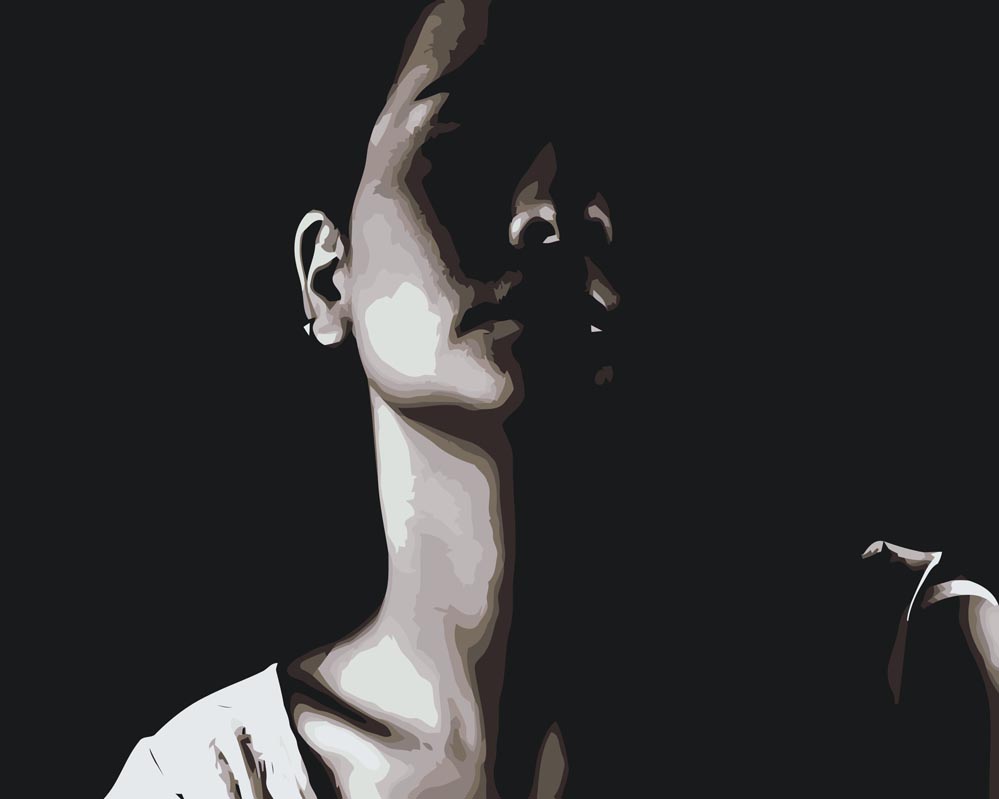
7. and 8. – dark photo with faces hidden by shadows.
Any shadows in photos will be captured by the software as unpaintable, plain dark areas.
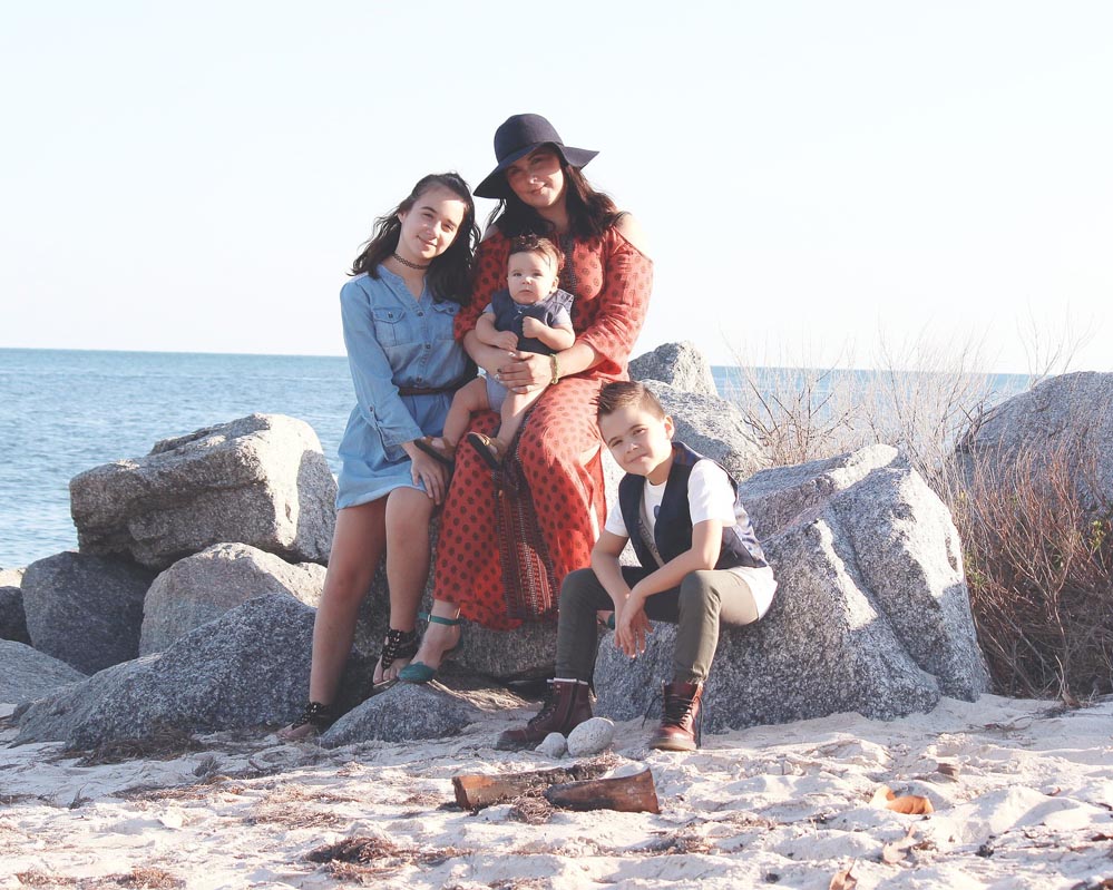
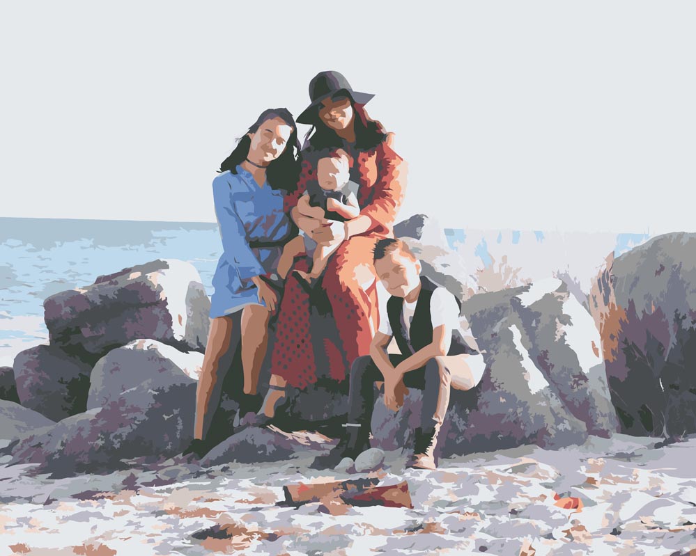
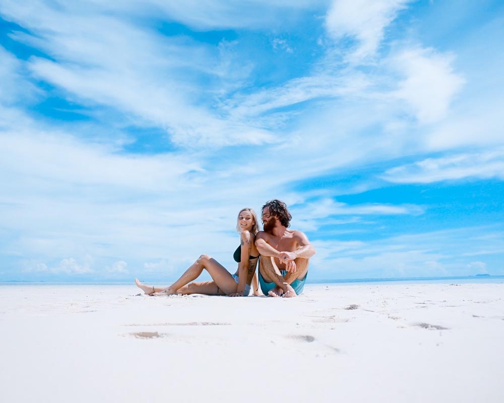
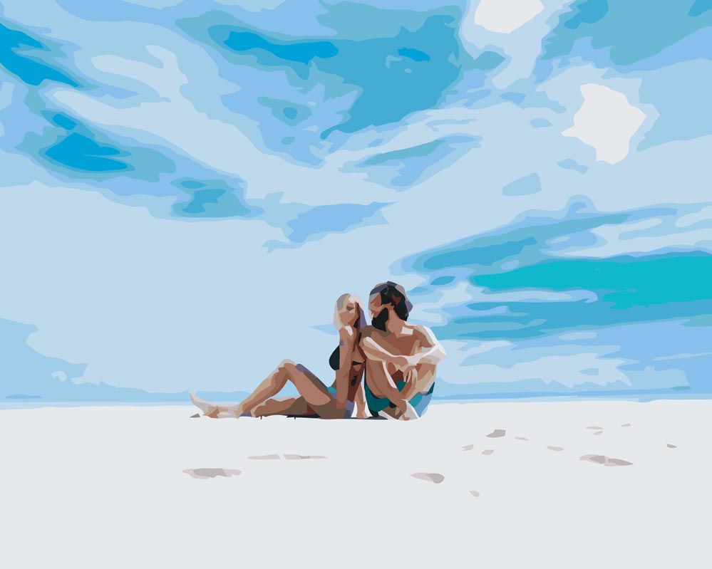
9. and 10. – photos from a distance/ wide shot background/ small faces.
The background on the graphic design will be drawn in detail, but the faces will be blurred beyond recognition.
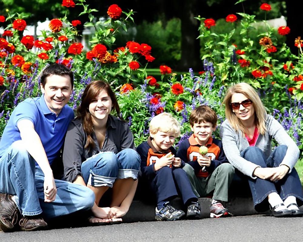
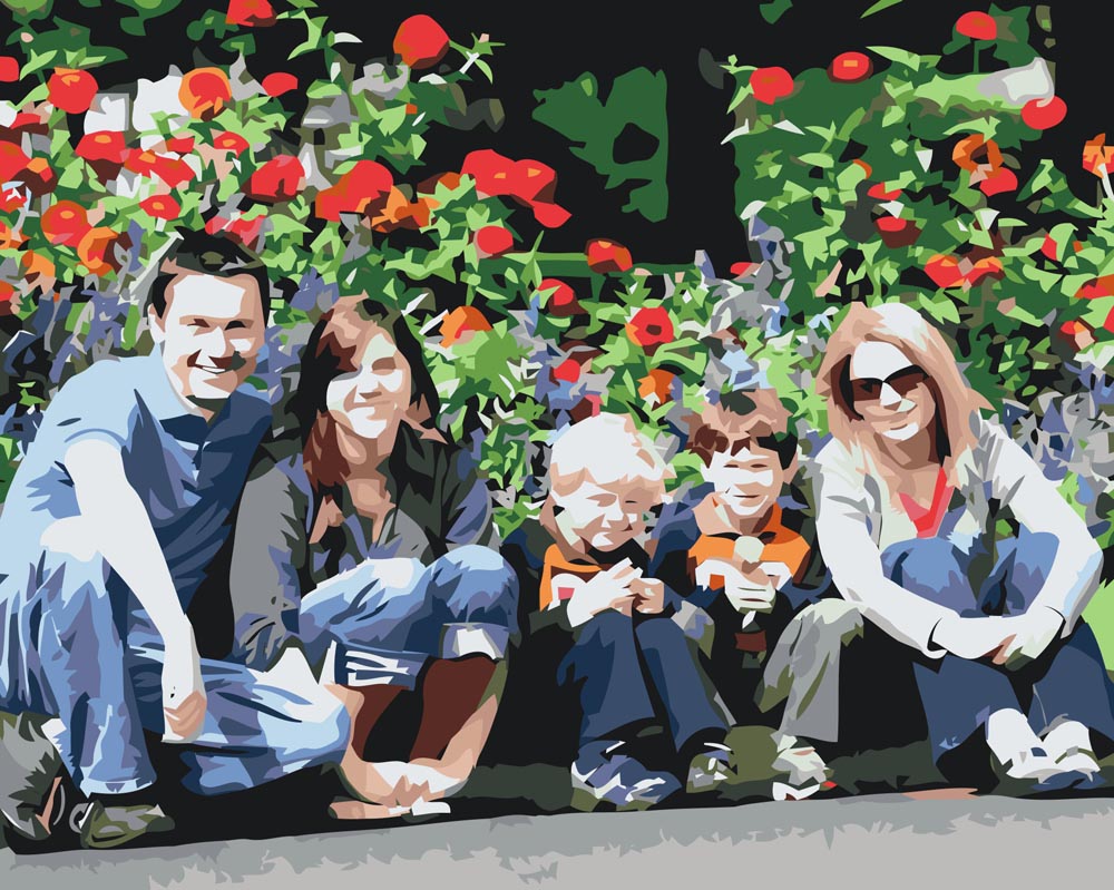
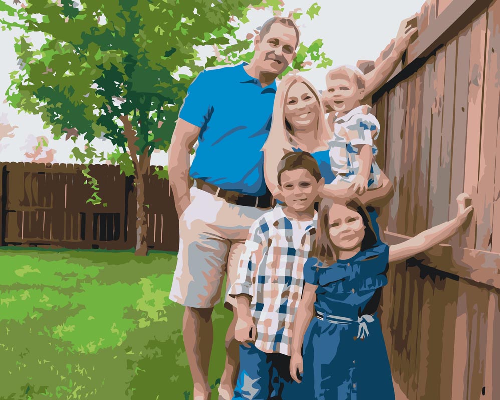
11. and 12. – low quality photos under 100kB/ grainy photos.
The graphic design software that creates the image for painting, will not capture facial details such as the eyes, nose and mouth.
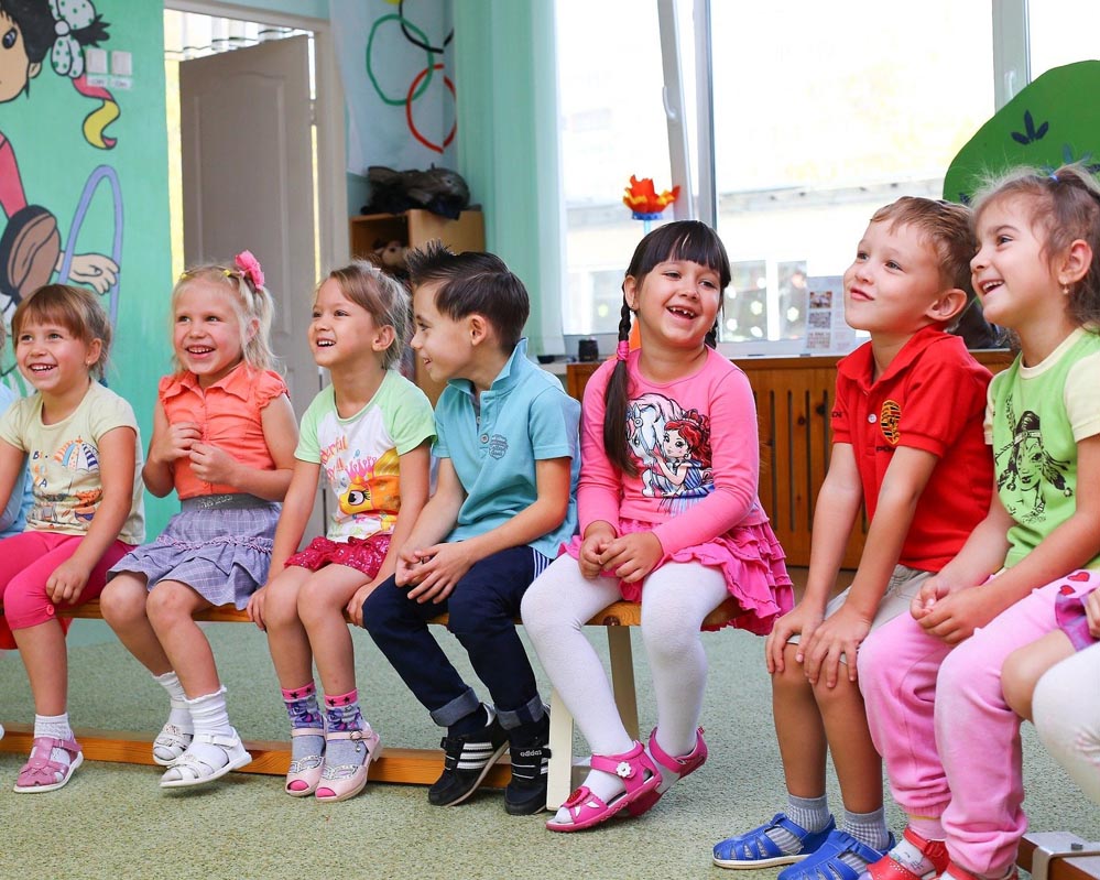
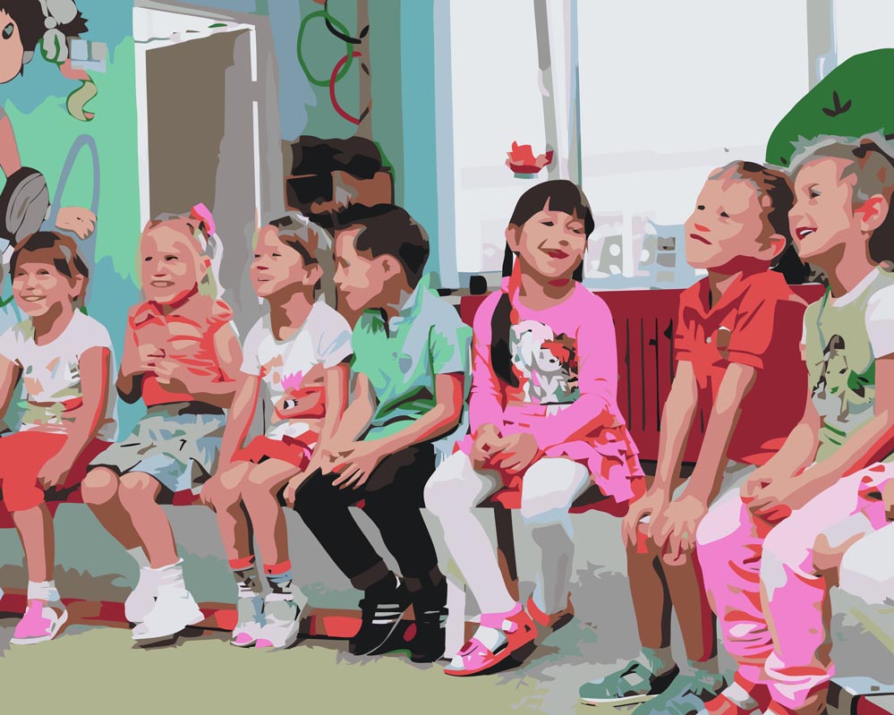
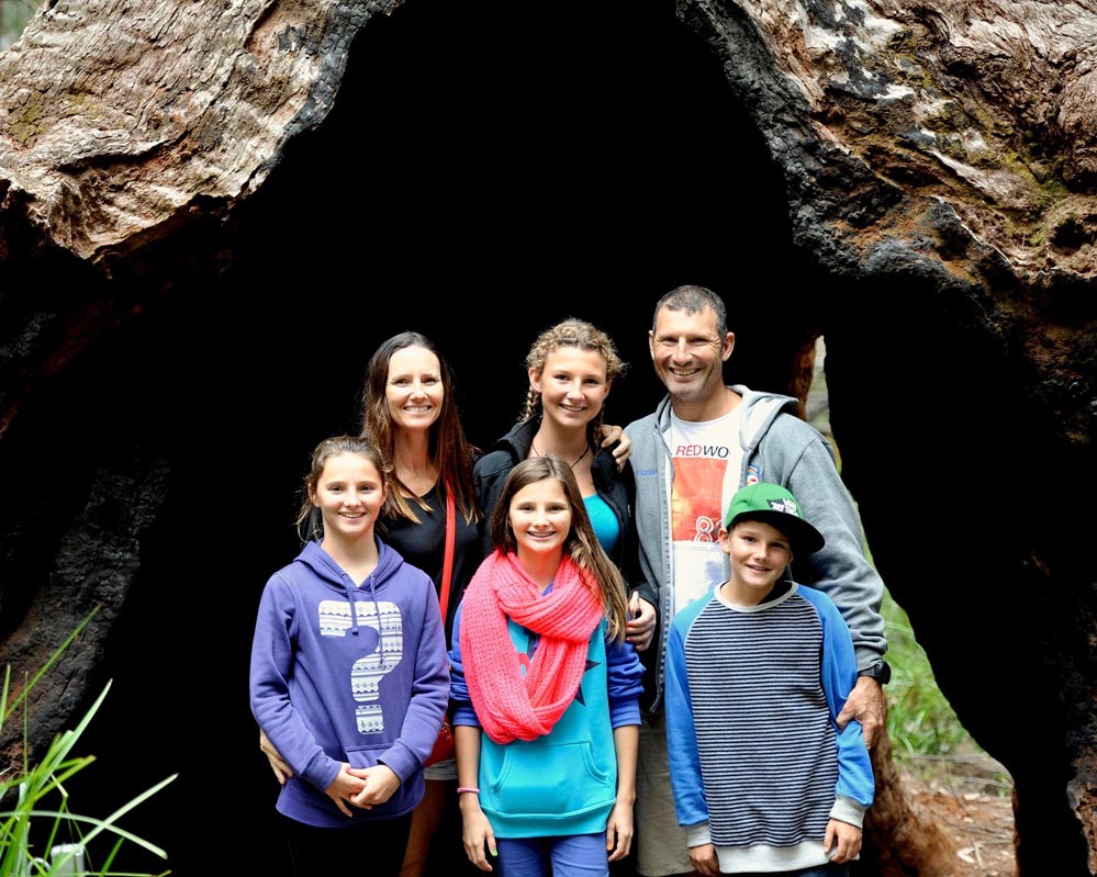
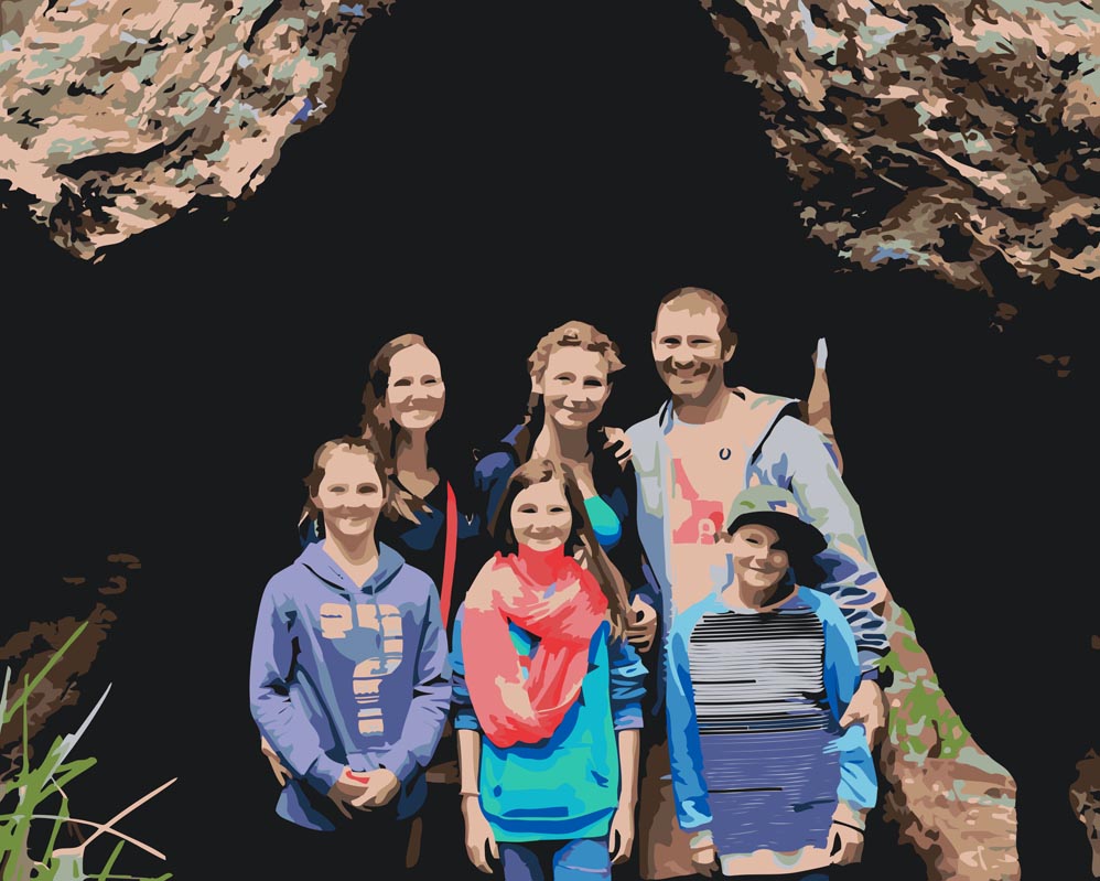
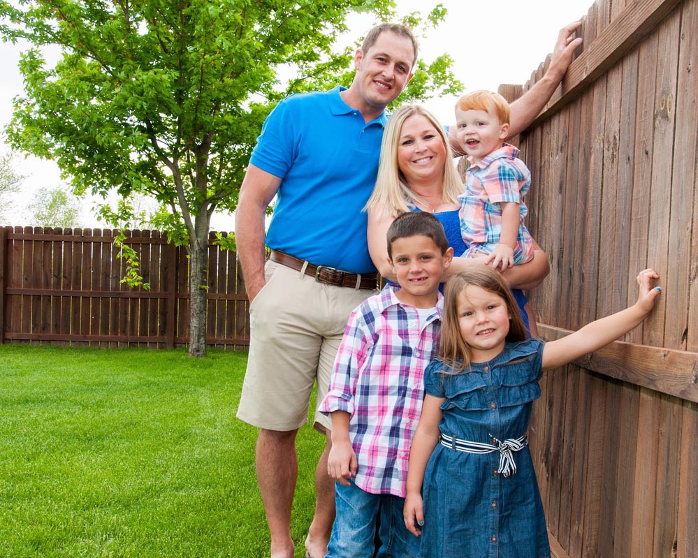
13. and 14. – a photo with too many people for the image size.
The software will not capture the facial details, thus the faces will look smudged.

